Design System ✕ Typography
Putting together a type system for your design system requires a system all of it's own
We’re 12 sprints into creating our Design System and it has become clear our typography system has some weak areas. It was established early, maybe sprint 2 or 3, just to get us started and it has done that well. As Marie Kondo would say, I thank it for it’s service and honor it’s sacrifice as we move to the next iteration.
Lately, some newer components have been unable to use the existing styles because the available Heading styles weren’t right, or the Labels didn’t really work, etc. I decided to take a look this sprint and give it a little remix.
The hardest part of this whole thing is that we actually don’t have a “final” design yet that I can work from. We’re in a weird spot where we aren’t basing the design system on the existing app and we haven’t done a redesign. So right now I’m essentially designing the systems of the system, not really the design decisions themselves.
Anyway! Here are some of the most useful resources I came across today during my research. I thought it would be helpful to put them all in one place.
Typography by Figma
Design Systems Typography Guide
This article on Figma’s Design System site is a great collection of helpful information and resources.
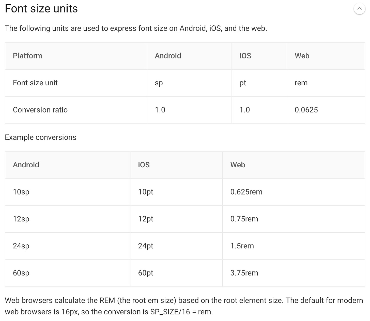
Material 2 Design OS Converter
Find the full write up and table at Material Design
Our app will be built for iOS and Android so I need to understand how to work with my engineers regarding type units for each platform. I thought this converter from Google was straightforward and easy to understand. It is a little older, being from their Material 2 site but I like it.
Modular Scale
From the man, Tim Brown, Modular Scale. This tool can calculate your font sizes for you based on a ratio.
Musical Interval Ratios
From https://24ways.org/2011/composing-the-new-canon
These are great to base your type scale on. Priyanka Godbole wrote a lovely article on how she used the Modular Scale combined with a musical scale when she updated her type library. Her process was easy to understand and well written.
Those items are my tool belt.
Using my tool belt, I’ve come up with some numbers I’m testing out which I’ll talk about later (I haven’t finished it yet xD), but more importantly - I’m currently testing out this system for categorizing type:
Display
Heading
Paragraph
Label
Display is for larger, expressive moments (think Hero text, large number displays). Headings are for our standard use cases of defining a section of content. Paragraph is for long-form content (I previously called this “Body”). And Label is for things like buttons, badges, form fields, etc.; elements that are typically short and smaller in nature.
Each of these can have an optional Modifier; right now I’m adding Uppercase and Bold. With these modifiers, I can remove some of the old styles in our system which are essentially just a bold version and non-bold version. We will end up with more variables, but I think that’s fine.
Can’t wait to share the final version and see what we come up with in the end. I wonder if it will change? I would love to work with our internal brand team on the future version of the typography stack. It’s a critical piece of the overall look and feel. I hope this system gives the flexibility we need in whatever the future design ends up being. See you next time!


